High LRV values increase light Providing a Safer Education Building
Improving access to buildings for all users in line with the
Equality Act 2010 is fundamental and specifiers are using as
many tools as possible to ensure that buildings are
designed or refurbished in order to create an inclusive
environment. Studies, including Project Rainbow
(a research project carried out by Reading University in
conjunction with the Royal National Institute of Blind People
(RNIB), The Guide Dogs for the Blind Association (GDBA)
and ICI Paints) identified the importance of colour and
contrast in improving the built environment for visually
impaired people.
Project Rainbow identified that colour and
contrast can provide designers with a mechanism for
highlighting critical surfaces and special features providing
the basis for way finding for visually impaired people.
Project Rainbow states that:
Critical Surfaces: identified as large areas of an
interior that form the impression of shape,
space and proximity when scanned by a visually
impaired person, i.e. floors, walls, ceilings,
stairs and doors.
Project Rainbow continues to inform that ‘navigating
through a building is much easier if these areas are colour
contrasted’ and expands on specific details:
Patterns: For general areas, some critical surfaces may
be covered in a subtle pattern or striped finish to create
an attractive and interesting finish, but where a high lrv
contrast is required highly contrasting colours in irregular,
busy or geometric patterns are very unhelpful and should
be avoided. If a pattern is used on a critical surface it is
the colour that occupies the largest proportion of the area
which is the most important.
Reflective Finishes: On critical surfaces, the use of
highly reflective shiny surfaces (i.e.: LVT) can cause
considerable confusion for visually impaired and fully
sighted people.
Such finishes should always be used with
caution, and wherever possible, matt or mid sheen finishes
are recommended such as carpet tiles. This will also allow
for the full benefit of colour differentiation to be realised.
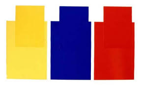
Two Colours Used:
On critical surfaces where two
colours are to be used…the upper part of the wall should
be sufficiently different from the ceiling colour and the
lower wall should be sufficiently